

Atlanta: In the Studio With Jiha Moon - New American Paintings Blog, January 2011
Jiha Moon is an Atlanta-based painter whose gestural paintings explore fluid identities and the global movement of people and their cultures. Featured in editions editions 63, 70, and 82 of New American Paintings, Moon was recently a finalist for the Hudgens Prize, selected by jurors that include the Curator of Prints at The Whitney Museum of American Art and the Director and Curator of Exhibitions and Public Programs at The New Museum. I had the chance to visit with Moon at her studio where we discussed her recent incorporation of fabric and collage, a bold step for someone who self-identifies as “a painter’s painter.” More images, and our conversation, after the jump. —Paul Boshears, Atlanta contributor
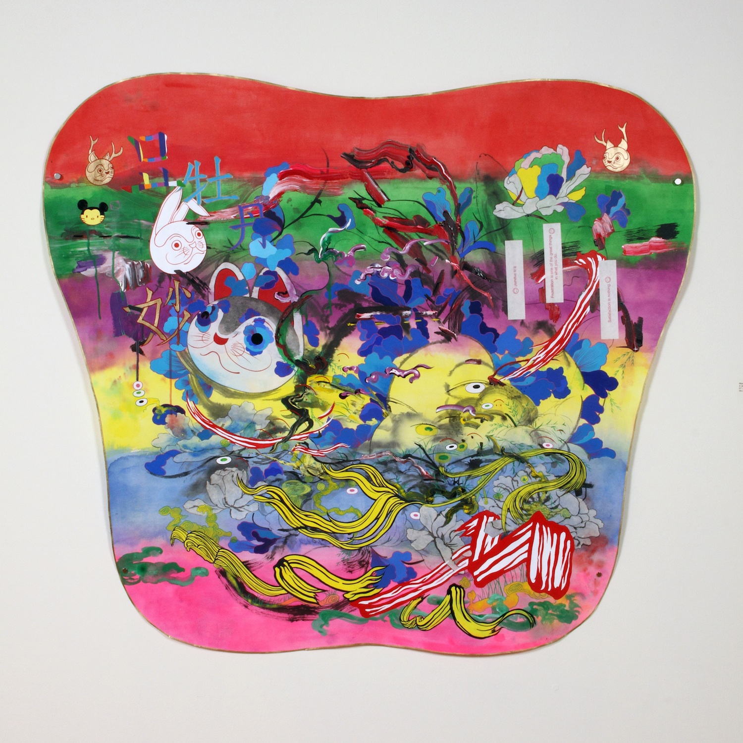 Jiha Moon, Mystery Myo - frustration is one of the great things in what you do, 2010 | Ink and Acrylic on Hanji, 51 x 44.75 inches. Courtesy of Saltworks Gallery, Atlanta, GA.
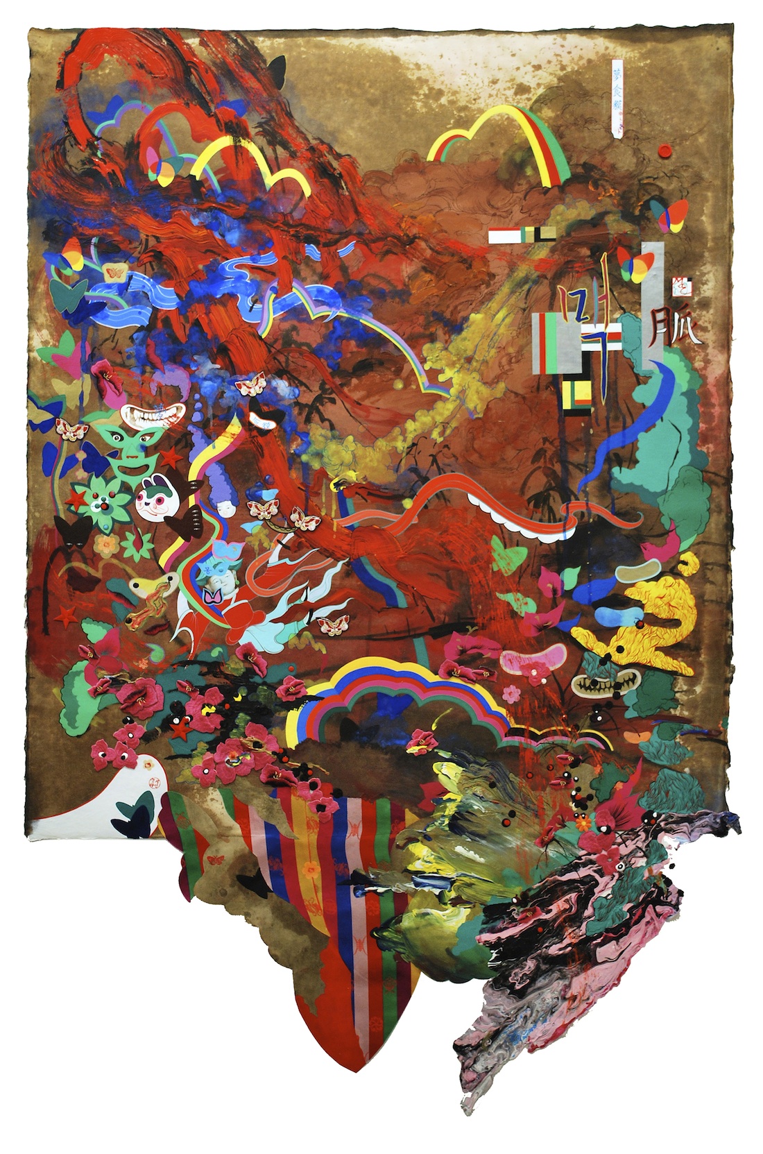
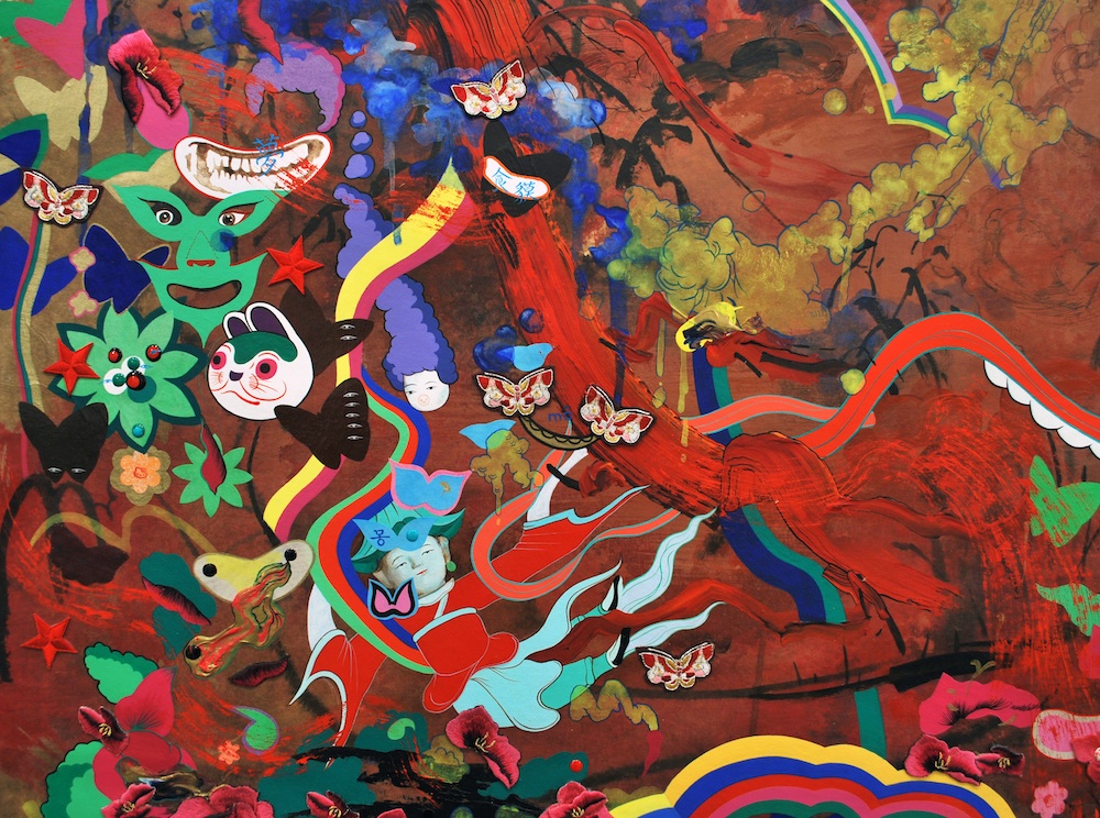
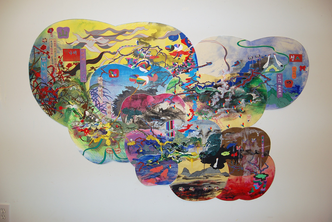 Jiha Moon, Nabiya, 2010 | Mixed Media, Ink and Acrylic on Hanji, 41.5 x 66 inches. Courtesy of Mary Ryan Gallery, New York.
PB: You’ve described yourself as a cartographer of culture. What kinds of maps are these?
JM: The cultural maps I make explore the ways in which an image can be read in one way in one culture and have a totally different read in another culture. Translating cultural incongruities is one of the most exciting and nerve-wracking experiences I have. They happen every day. I’m not digging through a book of art history or philosophy; my work is concerned with the everyday experience. The images I use are commonly experienced, they’re everyday experiences that are familiar to anyone, but I twist them.
I make these icons less recognizable with many layers and draw the audience into these weird positions where the images feel familiar, but they can’t name it quickly. In this sense, the maps that I am building are more of a ‘mindscape.’
To discuss qualities of your brush work, the term “calligraphy” often comes up. But I think that there is something lost in translation here. In the West we tend to think of calligraphy as simply ornamental or decorative handwriting, whereas in the East Asian context one’s ability to render characters is also a means for understanding the character of the individual that has rendered them.
The ways in which I use calligraphy is fairly untraditional, actually. When someone uses black ink to write these characters, there is this strong association with “Asianness” and for that reason I try to use really strange colors instead. I don’t want my work to be seen as cultural tourism.
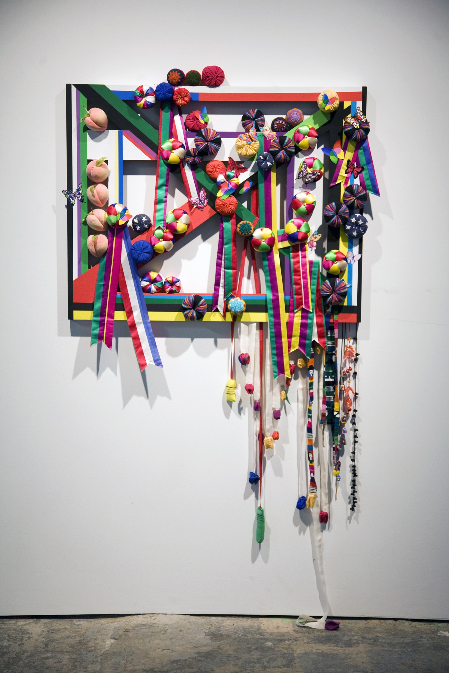 Jiha Moon, Rota, 2011 | Mixed media, 27.5 x 35.5 inches. Courtesy The Fabric Workshop and Museum, Philadelphia.
You are starting to work now with fabric. What prompted that shift to these new materials?
My work is going toward mixed media now, but I really don’t like this term, “mixed media.” I’m really hung-up on being seen as a painter, but this can be very limiting. At the Fabric Workshop in Philadelphia, I’ve been combining painting with different fabrics. Now I am incorporating a lot of collage materials in my work on paper and on canvas. I’ve historically covered panels or canvasses with Hanji (traditional Korean mulberry paper) and now I am doing the same thing with fabric. Working with these new materials has been great for me, a sort of breaking point.
I have to talk about this a bit in terms of my mark making. The lines, the colors, everything comes together as a sort of code. The strokes that are required to write certain characters then begin to dictate the way the lines that I am putting in the next layer of the work. I may start with a really gigantic, spontaneous, and fast brushstroke and then go around and outline every single thing. What’s happening here is a slowing-down of time. I may have done the initial stroke very quickly but now I am following-up very meticulously and slowly.
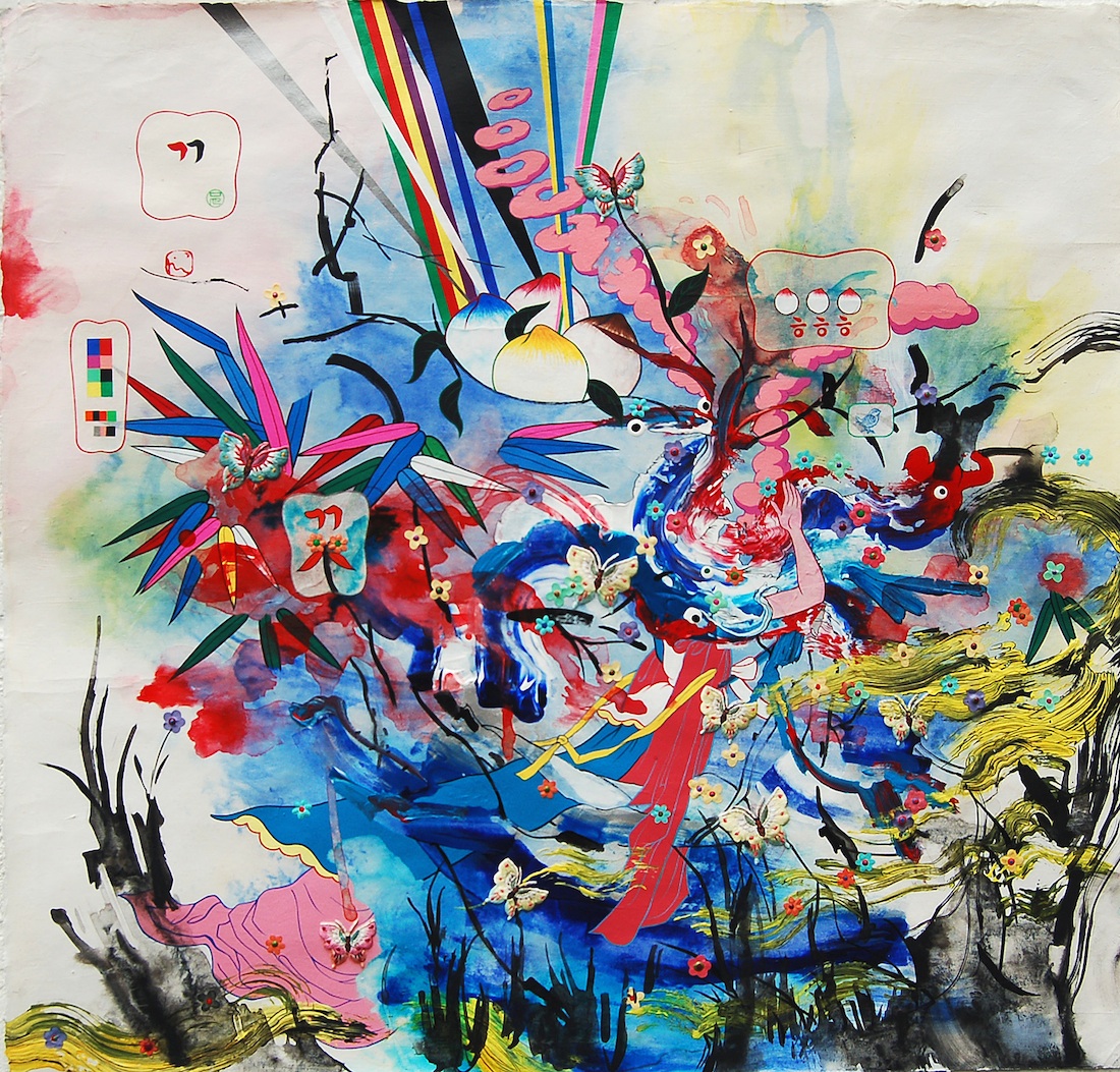 Jiha Moon, Alice! Alice!, 2010 | Ink & Acrylic, Fabric, Embroidery patches on Hanji, 28. 5 x30 inches. Courtesy of Saltworks Gallery, Atlanta, GA.
You often state that it is important that your work be fresh-looking. What do you mean by this?
I believe that my first brush-stroke should have the same amount of attention as the more detail-oriented and time-intensive marks. If you look at some of my mark-making, you’ll see that they are linked. The first layer is just as important as the heavy impasto area. It’s a metaphor for life also; all the layers of painting, like the phases of my life, they are all equal. There is this democratic action in my work and sometimes people don’t see that.
The labor intensity of my work isn’t necessarily obvious to the viewer because you really have to be up close and looking at it to see how intensley I’ve worked these pieces. It’s not just a bunch of pretty colors and energetic, fast brushstrokes, it’s really heavy, labor-intensive work. This is why I use paper; paper allows it to be more visible. Paper makes the work seem light. I’m trying to bring two extremes together in my work: the lightness of working on paper with heavy concepts and heavy labor. Because I love the drama of the two together. I love that about American pop culture. Pop Art is a heavy influence for me; the melodrama and emotion of it.
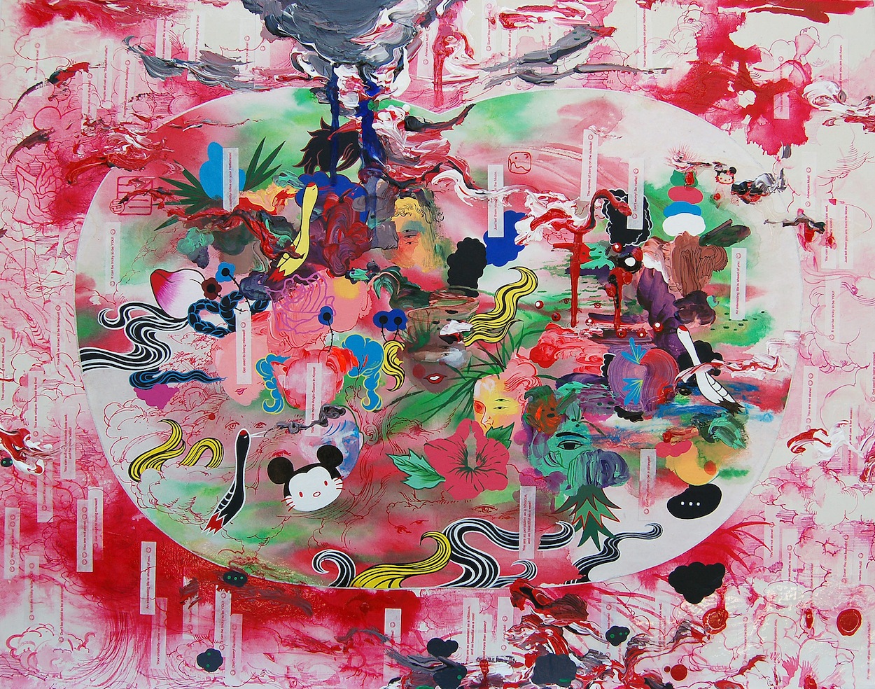
 Jiha Moon, American Appendage, 2010 | Mixed Media, Ink and Acrylic on Hanji, 56.75 in x 37.5 inches. Courtesy of Mary Ryan Gallery, New York. Below: detail.
When you incorporate smiley face stickers into your paintings there is more going on there than simply an ironic use of a popular icon. Why icons?
Iconography is the most important layer to understanding my work because icons mean a lot in our every day lives. Everyone today has a computer or a cell phone and they employ icons to mediate the intention of the users. If you want to communicate with others, there is an icon that has to be pushed or selected in order for you to communicate. It’s everywhere, like a visual dictionary of communication.
In this way, I think of the Cheshire Cat from Alice in Wonderland. I use his smile a lot in my work. He can be a very humorous addition, but he’s also very misleading. A lot of the time, presupposing identification can mislead you. I might use a rainbow flag that would have a strong meaning in a Korean context, but it might also be read like it was the gay pride flag. My work is largely concerned with misreading and communication between people.
It seems like an obviously-answered question, “Why this need for tension?” But why are you so motivated to cause this drama?
I really want my work to resemble other people’s lives. Tension is this great way to celebrate everyday life. So I take cues from everyday life, like in the grocery store. For example, the little label sticker on an item. What’s so drama-inducing about a little sticker? Not much, right? But in order for us to understand it, there is a wealth of symbols and meanings and intentions that have to be understood as well and that is where the tension lies: getting clear communication. I’m trying to get you to revisit the everyday stuff and question it, reconsider the drama of everyday life, focus on the day to day.
 Jiha Moon, American Halfie, 2010 | Ink and Acrylic on Hanji, 22 x 28 inches. Courtesy . Courtesy of Mary Ryan Gallery, New York.
Jiha Moon‘s recent work will be exhibited at Philadelphia’s Fabric Workshop and Museum in the exhibition New American Voices II, also featuring Jim Drain, Robert Pruitt, and Bill Smith, opening February 4. Jiha Moon was included in New American Paintings editions 63, 70, and 82.
Paul Boshears is a cultural critic based in Atlanta.
newamericanpaintings.wordpress.com
-
American Appendage
Mary Ryan Gallery, New York…
By mashing up common cultural touchstones, South Korean-born…
by Laura Hutson, May 19, 2011…